
The slider question format is a fantastic tool for comparative decision-making, and respondents enjoy using them in surveys if you don't use them in the right way and don't over load the survey with them. The question commonly arises however, as to how the data from slider questions compare to standard range questions. In fact they have been singled out as one of those sexy question that can deliver dangerous answers.

Sliders, should they be classified as one of those sexy question formats that give dangerous answers?
The short response to this is that yes there can be significant differences between the answers given to slider questions compared to their standard range question counterparts, but if you know the primary reasons behind this and understand how to use them effectively they can be an incredibly powerful and engaging question format to use in a survey.
These are the main issues to you need to be aware of when using them...
1. The slider position can greatly influence the slider score
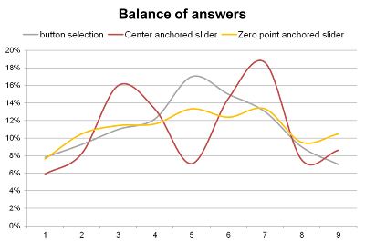
The main difference between a slider and a comparative single-choice range question is that the slider normally has a prompted starting point which influences how people answer. Without a prompted starting point (like you have with standard button selection) respondents have a tendency to click in the middle of the range. If the slider starting anchor point is initially placed at the center of the slider range is it like asking a 5-point range question with option 3 already being selected. Our instinct is to move it up or down and as a result you see when you examine the distribution of answers a what could be described as a double camel hump.

If the slider starting anchor point is positioned at the zero of the scale, the respondent move the answers up the scale but the answers are more weighted towards the bottom of the scale and infact across the whole range you tend to see flatter more evenly distributed data.
The effect can be significant see the chart below as a real example of 3 groups of people asked the same set of questions, one group with a 9 point unprompted standard button range, one group with a center anchored slider and one a zero anchored slider.
So which is best?
I would argue that the aim of any range question is to encourage a good event spread of answers and on that basis you could argue that a zero anchored slider delivers the most even distribution, button selection answers are too center weighted and center point sliders underscore the middle point.
This is fine for what is technically described as "unipolar" scales which natually start at zero, e.g. a 9 point rating scale. However there is an exception when you might want to consider using center point positioning if you are for example trying to understand if people agree or disagree with a topic you might actually want to discourage people center point scoring as this is in effect opting out of giving an opinion, in this case centrally anchored sliders might be preferred.

2. Range labelling protocols
On a more subtle level, the labeling and even the tagging of the point scale on the slider can influence the response. If there are many labels, respondents tend to treat the slider like a single-choice point range, while fewer labels encourages respondents to exercise greater freedom. Numbers are a less prompting way of allowing respondents to make more refined choices.
The chart below is a good example of the anchoring impact of range points. This was a zero anchored slider with a 100 point scale range but the strongly delineated anchor points encourage massive peaks in answers at each anchor point on the scale.

We recommend a 5 or 9 point numbered range but understated, with the extremes labelled at each end to encourage the smoothest and most even distribution of answers.
3. Slider sizing
The width of a slider can also influence response. Micro sliders respondents are more likely to move right to the end. If the slider range takes up the whole width of the page, respondents are less likely to select the extreme values compared with a narrower visible range.


As a result, try to stick to a standard width when using sliders.
4. Use of Iconography to emphasise choices
There are many ways of decorating a slider response range to make answering the question more fun in term tend to put a bit more effort into answering the questions. This can be valuable in increasing the quality of response, but such iconography can have an overt influence on the results, so care must be exercised in their use.

5. Warning - You may see higher levels of neutral scoring than you want with 5 point slicing of data
If you are trying to differentiate opinion using central anchored sliders you would be advised not to slice up the data using a 5-point range as this will disguise a certain amount of positive or negative movement.

This is because if respondents move the slider only a small amount up or down to register positive or negative opinions. In the example above, all three of these responses, when consolidated into a 5-point range, would score ‘3 = no opinion’, when is it clear that they have all expressed an opinion.
This anomaly can be solved by using more precise ranges when slicing the data (which normally should be stored in a 100-point scale before being partitioned). We recommend a 9-point slice, and then, if desired, the resulting slices can be consolidated into a 5-point range thus: 1&2, 3&4, 5, 6&7, 8&9.
6. Strength of opinion: the extra variable you get with sliders
With any standard range question, the levels of agreement are fixed, with usually very blunt choices such as ‘agree’ or ‘strongly agree’. With a slider, respondents are able to define their own levels of agreement, leading to more precise differentiation and better understanding of the strength of opinion.
7. Right-leaning movement


Well a great deal of detailed research has been undertaken into this topic, and so this is a summary of the main issues and a guide to how to effectively use sliders in your online surveys.
Sliders, should they be classified as one of those sexy question formats that give dangerous answers?
The short response to this is that yes there can be significant differences between the answers given to slider questions compared to their standard range question counterparts, but if you know the primary reasons behind this and understand how to use them effectively they can be an incredibly powerful and engaging question format to use in a survey.
These are the main issues to you need to be aware of when using them...
1. The slider position can greatly influence the slider score
The main difference between a slider and a comparative single-choice range question is that the slider normally has a prompted starting point which influences how people answer. Without a prompted starting point (like you have with standard button selection) respondents have a tendency to click in the middle of the range. If the slider starting anchor point is initially placed at the center of the slider range is it like asking a 5-point range question with option 3 already being selected. Our instinct is to move it up or down and as a result you see when you examine the distribution of answers a what could be described as a double camel hump.
If the slider starting anchor point is positioned at the zero of the scale, the respondent move the answers up the scale but the answers are more weighted towards the bottom of the scale and infact across the whole range you tend to see flatter more evenly distributed data.
The effect can be significant see the chart below as a real example of 3 groups of people asked the same set of questions, one group with a 9 point unprompted standard button range, one group with a center anchored slider and one a zero anchored slider.

So which is best?
I would argue that the aim of any range question is to encourage a good event spread of answers and on that basis you could argue that a zero anchored slider delivers the most even distribution, button selection answers are too center weighted and center point sliders underscore the middle point.
This is fine for what is technically described as "unipolar" scales which natually start at zero, e.g. a 9 point rating scale. However there is an exception when you might want to consider using center point positioning if you are for example trying to understand if people agree or disagree with a topic you might actually want to discourage people center point scoring as this is in effect opting out of giving an opinion, in this case centrally anchored sliders might be preferred.

2. Range labelling protocols
On a more subtle level, the labeling and even the tagging of the point scale on the slider can influence the response. If there are many labels, respondents tend to treat the slider like a single-choice point range, while fewer labels encourages respondents to exercise greater freedom. Numbers are a less prompting way of allowing respondents to make more refined choices.
The chart below is a good example of the anchoring impact of range points. This was a zero anchored slider with a 100 point scale range but the strongly delineated anchor points encourage massive peaks in answers at each anchor point on the scale.

We recommend a 5 or 9 point numbered range but understated, with the extremes labelled at each end to encourage the smoothest and most even distribution of answers.
3. Slider sizing
The width of a slider can also influence response. Micro sliders respondents are more likely to move right to the end. If the slider range takes up the whole width of the page, respondents are less likely to select the extreme values compared with a narrower visible range.


As a result, try to stick to a standard width when using sliders.
4. Use of Iconography to emphasise choices
There are many ways of decorating a slider response range to make answering the question more fun in term tend to put a bit more effort into answering the questions. This can be valuable in increasing the quality of response, but such iconography can have an overt influence on the results, so care must be exercised in their use.

5. Warning - You may see higher levels of neutral scoring than you want with 5 point slicing of data
If you are trying to differentiate opinion using central anchored sliders you would be advised not to slice up the data using a 5-point range as this will disguise a certain amount of positive or negative movement.
This is because if respondents move the slider only a small amount up or down to register positive or negative opinions. In the example above, all three of these responses, when consolidated into a 5-point range, would score ‘3 = no opinion’, when is it clear that they have all expressed an opinion.
This anomaly can be solved by using more precise ranges when slicing the data (which normally should be stored in a 100-point scale before being partitioned). We recommend a 9-point slice, and then, if desired, the resulting slices can be consolidated into a 5-point range thus: 1&2, 3&4, 5, 6&7, 8&9.
6. Strength of opinion: the extra variable you get with sliders
With any standard range question, the levels of agreement are fixed, with usually very blunt choices such as ‘agree’ or ‘strongly agree’. With a slider, respondents are able to define their own levels of agreement, leading to more precise differentiation and better understanding of the strength of opinion.
7. Right-leaning movement
There is a slight natural tendency in respondents using center anchored sliders towards moving the slider to the right, if they have to move it.

This small factor is only really a problem when trying to match historical benchmark data comparisons with traditional range questions. Overall, a shift of approximately 5% towards the right can be observed.
8. Up and to the right is positive!
Respondents tend to naturally assume that moving a slider up or to the right represents the highest score and most positive agreement. Care should be exercised when breaking this convention and marking the scale in the opposite way, with the negative choices at the top or to the right.
Interpreting slider data
For the many of the reasons explained above, slider data must be differently interpreted to range question data. In particular, researchers should establish protocols for dealing with respondents who agree or disagree with a statement only very slightly.
Slider data is often more refined than data from conventional range questions, and this is where their real value lies. For example, scores of 57% versus 59% in a range question might be indistinguishable, but the difference could be statistically significant between slider ratings for say 2 ads and imagine on a spend of £1m on a poster campaign, this could represent £20k more value.
The best way to compare is to use the absolute % range data. Unfortunately, most research data handling tools struggle to deal with this, so some smarter research companies ask us to process the data in 2 ways: a conventional 5 point split and a variant where only the 50% point is recorded as don’t know and the 51% and above and 49% and below included in the slightly agree/disagree ranges.
When to use sliders and when not to?
1. When asking respondents to make direct comparisons
Sliders are most useful when asking respondents to make direct comparisons between option choices, say for example rating the appeal of different designs of a product or common attributes about a brand or choice of colour. In circumstances where the subtle differences between ratings is important.
A good example of how sliders can be used effectively in a surveys can be a taken from Sony Music UK, who use a set of vertical sliders to ask respondents to calibrate how they feel about different aspects of a music artist character. In conventional surveys this would be a bank of 10 point grid options. We discovered that the impact of switching to using sliders resulted in respondents spending more time and applying more thought to the process. What it encourage respondents to do was review tweak their previously set range choices as they went through the process which is something that you see rarely every happen with grid answering.

They are of less benefit when the interrelationship between question options is less important: for example, when asking a set of attitude statements that are not related for example:
How much do you agree or disagree with these statements:
I watch a lot of TV
I believe in capital punishment
I like Pepsi
In this case there is no relationship between these 3 questions and by grouping them together in a slider set you will end up with relative prompting effects. For example you may well like Pepsi but may also have very strong views on capital punishment which would prevent you from moving the slider as high as you would do if say the comparison was between liking Pepsi, Vinegar & Salt water.
i.e. when asking respondents to move sliders that are grouped together you are asking them to make a relative comparisons and the options each are compared to have a lot to say about the answers you give.
2. When you are interested in the spread of the strength of opinion.
Sometimes people simply do not have strong opinions about things, or find it difficult to make a distinction between choices. Sliders can help you measure the strength of opinion and help you make judgements about how important a choice is to respondents. I suppose in an analogy to mathematical differentiation, sliders give you clearer way to identify rate of acceleration as opposed to speed.
3. Because it is more fun!
This might be regarded as a factious comment, but is important to understand how significant a factor respondent engagement is to the quality of data you get back from online surveys. When used in the right sort of way, sliders can make answering questions more fun and there are lots of creative ways to make answering sliders more fun.

Research shows that this can lead to respondents paying more attention to the answers they give.
4. The under-12 rule
The novelty value of sliders can quickly wear off when respondents are presented with too many banks of them. Because it takes a little more attention to move a slider than press a button, we recommend switching to a different question format if more than 12 options are being asked (roughly enough to fill 1 page without scrolling).
5. Price setting
Sliders are very useful for price setting, within GMI interactive’s system you can link sliders up to a set of data point ranges with a lower and upper limit so they can be used to allow respondents to define for example a price or, date range

6. Linked sliders
Slider can also be linked together to allow respondents to allocate a budget or time spent to different options like in the example below. This is a lot more effective way of asking this type of question compared to the traditional approach of asking respondents to type figures into a box.

7. Double point sliders
For more specialist task you can also use 2 sliders on a range to allow respondents to set lower and upper limits for things, particularly useful for price testing products like the example below.

8. The Flag drop alternative
As a complete alternative to slider GMI Interactive have developed a flag drag and drop question format which can be used for the same type of tasks as you would for traditional slider. The benefit of this format is that it really helps to re-enforce the relative position of choices and in effect serves also as a ranking style question.

Very insightful article. The interactive survey poses some great opportunities and unique challenges, particularly if needing to make any comparisons vs. Historical data.
ReplyDeleteOne thought on the midpoint setting issue may be a gum ball type of machine dispenses the starting point at random spots on the slider and requires movement from the set spot. Usual QA checks can be employed to toss the straight liners. I can see other issues with this approach (added time, more unpredictable bias, etc.) but something along these lines might be worth exploring.
yes, this is a good alternative , in specific survey's where qualitative phenomenon is also addressed. more specific and to the point i guess. how does double range sliders are used needs to be explained in greater details.
ReplyDeleteoverall its very interesting and informative
thanks
Ekbote
What is the base size for the charts? What are the demographics? Where is the sample from?
ReplyDelete