

Over the last few years we have conducted a number of experiments exploring the role and use of imagery in online surveys, mostly as part of more wider research looking at how to effectively engage respondents in research. A lot of it is hidden away across several papers and reports and so I thought I would try and consolidate this learning into one blog post. This is my guide to the use of imagery in online surveys.
Now Imagery can have a very powerful role to play in online research, in the same way as they used in just about any other form of creative communication, as a means to more effectively communicate ideas, entertain, to engage, to trigger thinking patterns but they can also be quite disruptive when used in the wrong way. There are some define do's and don't to think about when using imagery.
I have heard a lot of people say they are concerned about using images in surveys because they can bias the answers people give. In some quarters there are even people actively campaigning against the use of images in survey. My viewpoint is this...YES it is true images can steer answers, in exactly the same way the words you choose can steer answers too and for that reason you have to use them very wisely, but don't use this as an excuse not to use them at all! It is important that you understand how they can influence answers and the reasons why. Armed with this information you can then set out to use imagery in surveys with more confidence and I hope this blog post will help.
I will start with the do's...
1. Using imagery to trigger the memory
Some of the early experiments we conducted were to investigate the role that imagery could have to stimulate the memory. We conducted a series of experiments where we asked people to recall things in a survey, principally brands and advertising and for some test groups we prompted them with some various visuals and measured the impact. Not directly to prompt them but to get them thinking.This example below is from one of the experiments that we published in an ARF paper. We found that by visually stimulating respondents with these images of different advertising media prior to asking them to recall some recent advertising it encouraged them to list 60% more ads.

If you compare the average brand awareness when you prompt with a picture of the brand compared to just name of the brand there are often enormous differences.
Take the example below taken from an experiment we conducted to explore this issue where we measured awareness and purchase consideration of a range of yogurt brands, half the sample were shown just the brand name the other half an image of the product. Average brand awareness increased by 20% and purchase consideration by 40%. This is perhaps not surprising if you think about how we process shopping brands almost entirely visually, we rarely hear the brand name used in isolation unless they advertise on TV or we actually purchase the brand and talk about it. So brands like "Frijj" which 70% of the population are aware of when you show the packaging only 40% can recall by name only. You could argue that without imagery measuring brand awareness of supermarket brands like this almost meaningless.


2. Using imagery to stimulate the imagination and triggering emotional responses
When we asked a group of mums to talk about their experience of using baby wipes and we showed them this picture below of a baby a long with a bit of emotional rhetoric we went from 18 words per respondent to over 35.
Likewise imagery can really help stimulate our imagination, and again the more resonant the imagery used the more powerful the impact it can have.
Here is an example of another classic experiment we did we did where we asked people to recall foods they dislike eating and we show them this image of a woman expressing disgust. This prompted respondents to list 90% more food items that the simple text only variant of the question stimulated.

3. Using imagery to help communicate ideas more effectively...
Have you ever had to start a survey with a big block of text explaining what respondents have to do like the example below...


This type of approach to using imagery at the start of a survey we have explored in quite some detail in research for an ESOMAR paper I published with Deborah Sleep at Engage research called "Measuring the value of respondent engagement" and found introductions like these also had a major influence on improving overall survey completion rates. The majority of dropout from surveys occurs in the first 5 frames and these visual intro's proved to reduce dropout, on occasions, by more than half .
4. Using imagery and iconography to help interpret and digest option choices more effectively
Strings of words at a glance are very difficult to digest and when you are asking people to evaluate a series of strings of words like we do with say grid question things it is often difficult to differentiate between individual options. What that means is respondent have to hold in their working memory what each option choice means which is hard work.

Take this example above, at a glance in the text version all these options fade into one you have to carefully read each one to clearly understand them and imagine you are asked this question repetitively about 10 or 20 books its difficult having to read and clarify these options repeatedly. But with icons once you have read the first couple they are almost instantly decodable making it so much simpler to answer this type of question repetitively, you can view the icons in your peripheral vision meaning you don't need to store anything in your working memory. As a result questions using visuals like this are easier to answer and deliver back better data.
5. Using imagery to generate more cross consistent data
We have also discovered that using imagery and iconography in range sets can deliver back more cross consistent answers, particularly when conducting international research where words can be interpreted differently in different languages have different meanings in different cultures. With some exceptions, images tend to be more consistently interpreted than words.Take the example below where we compared across several markets the balance of answer to a question using a standard like range v a facial range. Whilst the pattern of answers overall was identical, there was a 25% reduction in intra-country data variance. If you are interested in reading more about this I would point you towards the ESOMAR Asia 2012 paper that I wrote with Duncan Rintoul from the University of Wollongong called "Can gaming technique cross cultures" that discusses this in more detail.

6. Using imagery to make questions more fun and engaging to answer
In this same paper we explore the value of making selection processes more fun and engaging and we found consistently in every market we tested that, more fun meant better engaged respondents who focused more on their answers. If anyone has seen me present they will recognise this example below which I cite in nearly every presentation I do on this topic. We added to the end of a standard set of sliders a character who would move from being asleep to standing up applauding as a visual proxy for how much people enjoyed watching. This improved enjoyment scores, consideration time, increase the standard deviation in the answers by 20% (an indication of data quality) and reduced intra country variance by 23%.
7. Using imagery to help maintain peoples attention in a survey
One of the challenges we face in survey design is maintaining peoples attention levels as they proceed through a survey. In experiments we have conducted where we have placed the same multi-choice question at different points in the survey we have found the number of choices on a list respondents can be bothered to tick can fall off by in cases up to 50%. We have found that images can have an important role at helping to maintain respondents attention level as they start to get bored answering questions.This example below is a very good example of the impact that images can have at maintaining respondent attention. In this specific experiment we asked 600 respondents on a multi-choice tick list to mark the times they recalled drinking water on the previous day and using split cells of respondents we rotated the position of the question so 1/3 answered the question either at the start, middle or end. Half the sample were asked the question using text only the other half using an image.


For the text only group at the start of the survey an average of 3.1 water drinking instances were recorded by the middle it fell to 2.4 and at the end it had dropped to 2.1, when we added the simple image of a water tap to the question we found there to be significantly lower levels of answer decay moving from 3.2 to 3 to 2.6. The imagery did something to help motivate respondents who were flagging to put a bit more effort into answering the question later in in the survey.

8. Using images to improve the all round appeal of the survey take experience
Well designed image based surveys are perceived to be shorter, more enjoyable, less repetitive and have higher completion rates, time and time again in experiments we have been able to demonstrate this.The decorative power of imagery can have an all round effect at making people feel more comfortable and interested in the survey experience. I can show examples of surveys with 50% improvements in completion rates simply as a result of their visual appeal.
Now the Don'ts...
These are some important caveats to the use of imagery in surveys becuase its not all plane sailing!Here are the key issues:
1. Be weary of the literal interpretation of images
Warning respondents tend to be fiercely literate in the way they interpret images.Earlier in this post I illustrated an example of the differences in brand awareness when showing pictures compared to brand names and in most cases brand awareness increase, but with the exception of the 2 most familiar brands, where their awareness scores fell back slightly. In both cases it is because of the choice of imagery which gets more literally interpreted.


We conducted another experiment to explore the impact of the literal interpretation of imagery where we asked respondents to evaluate a range of musical artist and varied the picture we showed to see how it effected the artist rating. We did some preliminary research where we ask people to rate a range of different pictures of artist from which we picked the most popular and least popular image for each one. We then asked a separate group of respondents to say how much they liked each music artist, splitting the sample, showing half the highest rated picture and half the lowest rated picture. The choice of imagery had a dominating impact on respondents ratings, measuring an average 20% variance in scores.


Our solution in this case was to work with a basket of imagery see below example.

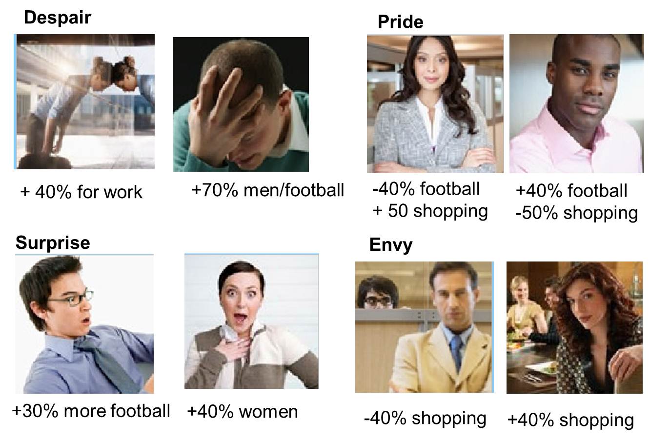
The literal interpretation of imagery become even more problematic when you are asking people to make emotional associations. We have found that the choice of imagery can have such an all dominating impact that this is the one area where we feel using imagery should be avoided, unless the pictures you are using have been very carefully selected and calibrated. In this experiment below we looked at the variation in choices of emotion people associated with doing different things when using imagery of men v women expressing each emotion. We witnessed upwards of 100% swings in selection rate as we swapped out imagery.
2. Anchoring effects of visuals in rating scales
Visuals can also have a very strong anchoring effect when used in range scales and here is an example...
Below are the results from an experiment we conducted to look at the differences in answers between facial and numeric rating scales. In this experiment we asked people to say how much they enjoyed doing a range of domestic activities ranging from watching TV, cooking through to doing the washing up and cleaning. When we used a numeric rating scale the answers were nicely evenly distributed, but the responses to the facial scale we found a disproportionate number of respondents choosing face no 5. The reason being that the emotional range used here was too strong to measure domestic activities, if you look at these faces, nobody is that ecstatically happy about watching TV or that angry about having to do the washing up and so in effect it narrowed down the choice range. This is because respondents again interpreted the images literally.


Here is a lesson though when considering using any form of iconography, be it smiley faces, thumbs up thumbs down or what ever - you must be aware that they can narrow down the distribution of answers. The benefit of using simple number ranges is that we can assign our own meaning on what the numbers means e.g. in this scale 1= washing up 7 = watching TV.
Now I would want to underline that it might be easy to use this as one of the excuse to avoid using more emotive ranges in surveys, what you have to remember though is that numeric rating process because they are less emotional are more boring to answer and as a result encourage far higher levels of straightling and ill thought out answers when over used in a survey which is just as much of a problem. So it is always a compromise. So my advice for this is not do or don't but maybee! Choose to them carefully and make sure they adequately reflect the range choices you are trying to measure.
So for example if you are asking people to rate how much they like fruit - well we all basically like most types of fruits its just a question of how much so using a thumbs up thumbs down rating you will loose all the nuance as respondents will only use the top half of the scales. If however you are asking people what they think of a range of political opinions, well in that case the thumbs up and thumbs down may be quite sensible range choice to use.
3. Poor quality logos and even logo size differences can alter perceptions scores
We also have investigated perceptions of brands based upon the style and quality of the logo used and found small but never the less significant differences in rating scores in a variety of different dimensions based upon the choice of logos.In one such experiments testing 20 brands, we saw shifts of average of 10% for brand “liking” score and 7% for “trust” score based on style of logo used (and individual cases recorded up to 20% shifts). Poorly rendered logos see an average 18% reduction in liking perception and 13% in trust. Size of logos presented seems to have a small but significant influence too. Presenting logo’s larger reduced Like and trust scores by an average 4%.

4. Choosing the right images
The selection of imagery for a survey IS A CREATIVE SKILL raiding the clip art library of powerpoint or spending 5 minutes on google images is not good enough. Think about how images are uses in advertising and that is the standard you need to think about.The whole point of an image is to help respondents emotionally engage with a task and simply and effectively communicate a message.
So this type of approach is not good enough (REG!)...


Summary of advice
The selection and use of imagery in surveys is both a science and and artform. They can have a critical role in engaging respondents and improving the quality of feedback but used thoughtlessly they can be highly disruptive.
Some researchers reaction to this is simply to avoid using them in surveys which might be reasonable enough response if you don't have confidence in how you are going to use them. But I personally think this is chickening out!
Think of imagery as a weapon you can use to bring survey questions to life....


jon, this reminds me of Fiveboys chocolate before your time, but similar emoting heads
ReplyDeleteivor
good post!
ReplyDeleteImagery is not only limited to surveys only. You can use it for other options as well such as education as well. Individuals at open university in dubai make sure that they use this approach as much as possible, as it helps them retaining the data as much as possible.
ReplyDeleteFor making your future bright we should work hard and try to get our goal. Online sources can be helpful for education. Here is online admission essay writing service which can solve your all problems related to examinations. Thanks for sharing this.
ReplyDeleteThis survey report is all about facts that quality of feedback but used thoughtlessly they can be highly disruptive. The qualitative research critique example will be more helpful to survey this.
ReplyDelete